Thursday 5 June 2008

BASE-V


BASE-V is a group of artists from São Paulo, Brazil. It started in 2002 with the publishing of the experimental magazine "V". After that, the group´s web site became a comunity of experimental graphic artists, exibiting works from all over the world ever since. The group works with several medias, from artesanal publications to graphic instalations, mixing supports and materials, participating in galery shows and street interventions.

Faile

"
Scratch the surface and eat deeper into the art and you would most likely sense a tinge of dualism and collaboration. They seem to dwell on things like love|hate, violence|peace, ugly|beautiful, war|peace and so forth. - Faile

"


Combines street artwith illistartion & fashion. Loose sketchy style all initaly hand rendered includling the stencils, styel of 1970's comic strips and carachters.

Daisy De Villenuene


A quirky, childlike imagination flows through the colourful books and felt-tip illustrations of Daisy de Villeneuve, born in 1975, London. Again very angled simply line drawing form her illistartions, I link her style similar to Kate Moross who has also worked for Topshop.

Wednesday 4 June 2008

Hungry Bears

Hungrey Bears in a organisation form my home town of Bedford, it promotes gigs and events in one of the nightclubs and main music venue, before this Bedford had nilche of new upcoming music and good club nights! Chris Smith is one of the dj's at the club, 'The Pad' and is currenlty working for Bedfordshire council on their graphic design team. These are some of his poster designs for Hungrey Bears, he has a very distinct cartoon style using straight lined drawing skills making them hevily vectorized and bold, also using dynamtic eye catching colours and use of text. Here are some of my favrouits:


Baldwin lounging in the park.


Click on the image to enlarge it!!

Tuesday 3 June 2008

Kerry Roper...


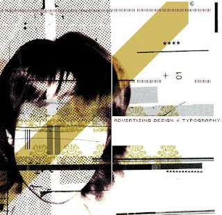
I personally love Roper's work. it combines mixed media, mainly photography digitally enhanced and composed with illustrations. On top of some of these compositions is type, this has become much more prominate within his later works. He studied at Buckingham shire college doing graphic design and now has become globally established as a graphic designer. His work has appeared in many books and magazines, including, 'It's a Matter of Illustration' by Victionary, 'Thousand Type Treatments' by Rockport, 'Typographics' by Rotovision and a major feature in the Japanese design magazine.
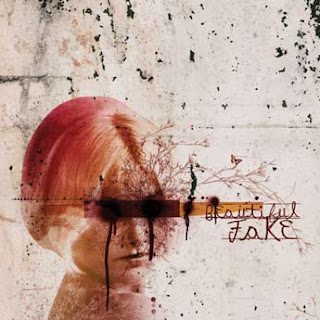
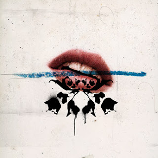
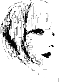
The thing which grabs me about his work, is the clustered layered of block colours, messy style which his work holds, yet at the same time there is clear precision and looking up close each line in immaculate. Recently he has worked with fellow designer Si Scott, and you can see a clear resemblance now between each others work which is now mainly illustration and heavily pixilated darkened imagery playing around with thershhold.

'Sigh' Scott


Si scott is a current designer in the lime light at the moment. He leaft school at 16 and then started at foundation course in Leeds at the college or art and design, Since then his work became noticed and now darts all over the country on business for clinets. Wat makes his work really stand out is his use with tpyography, producing some really innovative type.
He starts with rough sketches trialing layouts and picking at fonts, slighty altering them/changing them. Then he brings fineliners to the piece to bring it to life wiht his flowing, loose but highly intricque illistartions. Scott works on a much larger scale then the actual final image size, he draws it out then scans the illistations in at 1000dpi at 125% so when it is decreased to the actual size it is very crisp and clean looking image.