
BA (Hons.) GRAPHIC DESIGN – END OF MODULE SELF-EVALUATION
Level 2 – Design for Print and Colour Processes
1. What skills have you developed through this module and how effectively do you think you have applied them?
This module for me has been a huge learning curve and brought me into year 2 with a bit of a shock - but as a result know I know what is standard is expected of me and the level which I now should be able to achieve.
The module in particular has encouraged me to look outside the box when researching and to carry out much more in depth research by crossing a variety of mediums and by not always opting for the most obvious. In this project alone, I think I have done more in depth research than I ever did last year. I started off by actually visiting places to get first hand primary research on pricing and then this leading to doing two questionnaires based on the research that I had found. However I feel I could of found much more primary research when documenting my colour for print work, instead of opting for the obvious and simply photocopying books from the library and from at home. With this I should of collected more examples of the different print processes and explain each process in far more depth than I have covered.
I feel like I started out my research confidently & with good intentions but it slid back after a period, resulting into poor research into the print processes and stock.
Despite this, I feel though I have still learnt a great deal about print production, the processes and the consideration you need to make when designing for print. As I knew nothing about print before – and I simply though a printer was a printer and that’s all what print involved, so this was a huge eye opening in understanding how colour worked.
The workshops which we had were very beneficial, as a result I feel much more confident in using different departments and machinery on my own- it has encourage me to broaden my methods of printing compared to last year when I only ever printed on a scale of A3 paper.
Using screen-printing as one of print processes in this brief, also allowed me to explore it and as a result I now will always be able to use it as a print method. It has been something which I have always wanted to do and has encourage me to print my own t-shirt etc with my designs as side projects – as it is so simple and easy to do.
2. What approaches to generating work and solutions to problems have you developed and how have they helped?
For me this is realising that if I want to get work done productively I should use the facilities at college as much as I can. For the past 2-3 weeks I have been staying late at college to work on the ‘GOOD’ brief, after doing this I have seen how much more work I can produce in this environment compared to when I am working from home.
A big problem, which I encountered, was wasting my money in digital print. I have a tendency to rush into work without pre planning and reassuring that everything is in place before finally printing. This occurred when printing my final packaging cover and A2 design boards in full colour not realising that they were not aligned right or there were spelling mistakes. I learnt form this to always print off my work to scale to check its proportions and proof read it, to try and find spelling mistakes and grammatical errors.
I know also know that when I get a new brief to not leave it for a few days, but to get straight into it and start researching – as you can never have too much research, and I have also found that some of the best ideas simply come through this development and playing around with all the research which you have found.
3. What strengths can you identify in your work and how have/will you capitalise on these?
I am very pleased with my final lads mag style packaging and the inside information. I feel the colours work well together with the overall layout – creating the busy, jam packed, bold font, crude lads mag vibe. A few people have even come up to me and asked if it was an actual magazine, which I had found which I found very promising. I also feel that my illustrator skills have progressed enormously compared to the level, which I was ask last year, I’m constantly picking up on new skills and am ever growing more confident in it.
Similarly with In design, I was new to this last year and hadn’t touched it since. My skills are still slowly growing in this programme but I found myself finding it much more easier when discovering the relevant shortcuts to use in it & the grids to line my text and imagery up.
4. What weaknesses can you identify in your work and how could you exploit these more fully?
Time management and organisation has been my biggest weakness in this project. I feel very let down by the overall presentation and research into this project. I started out with good intentions and by the end of this module; I was rushing to complete it all in time. As a result I know that some of the standard of work within it is not my best, and I am capable of much better and I should have dealt with these areas before rushing at the deadline.
I do not think that my work shows a clear development of my ideas as my pack developed, what was going where, why and how? I rushed into these ideas with some of them not writing them down or recording them effectively.
To hep solve this, I am going to on the new module and further projects make weekly target plans in which I will stick in what I need to do by the end of each week. Instead of putting off work until there is pressure, I will start ahead when it is actually set and carry on from there. By the end of this project my bedroom at home was a mess, and you could not even see the floor – this obviously didn’t help me at all in try to start work and keeping my work organized and together. This is a problem that I really need to work on as it is making me behind.
5. Identify five things that you will do different next time and what do you expect to gain from doing these?
Plan ahead, and produce weekly targets to meet resulting in better time management & more work getting done without rushing.
Research fully, produce radical research and exploit it fully, leading to better concepts and information/understanding about my product or audience etc.
Proof read everything that I need to print for final pieces to spot spelling mistakes.
Use the college opening and closing hours more, as I now know that I get more work done here.
Start the project when it is given to us, don’t just leave it until a few weeks in.
1)Attendance - 3
2)Punctuality - 3
3)Motivation - 2
4)Commitment - 3
5)Quanity of work prodcueed 3
6)Quality of work 2
contribution to the group -3
Tuesday, 25 November 2008
Thursday, 20 November 2008
 I like this layout and the girl used within the cover, howerever she is a well known I am told page 3 girl and this is not what I want. I wanted to use a girl who was new and had the feel of a girl next door. Sje would be assecsable to males - if they went out, they could actually meet her and take her home.
This is the the design which I chose to take further and use for the final cover. The girl looks the most natural and everyday looking and it wearing some clothing which makes her seem even more attanable.

Thursday, 6 November 2008


Monday, 3 November 2008
Use of Spot Colour
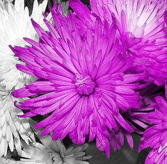
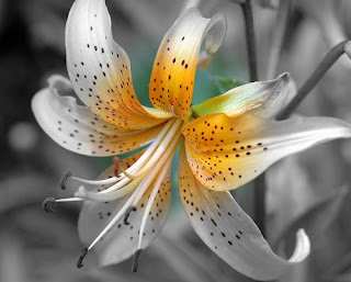
Spot colours can also be a selected area of colour on an image known as a spot of colour. This is mainly used on black and white imagery to draw attention to a particular area or make a statement. These types of spot colours are used more in an artistic way & aestheticla photography. Here are some examples below:


Pantone swatches
Spot colour. Here are examples of how spot colours are put into action - the image belwocme has used two spot colours form the swatch list above. It has used the a pantone shade of pink, Pantone solid coated 1905 C and red Pantone 185 C to create the bright colours within the image.


Colour Processes
Research into the six colour processes:
CMYK is shorthand for the colors cyan, magenta, yellow and key line black, each letter is pronounced separately. They are known together as the four color process or simply process color. CMYK works by chemically mixing the four colors together and by doing this it allows almost any color in the spectrum to be achieved.
This color model is worldwide and predominantly used the most in modern day industry offset printing (lithography). This print process works on a very simple principle, thank ink and water do not mix.
The images or text are put on plates, and each color has its own separate plate. These are first dampened by water then the colored by the ink, as a result the ink sticks to where the text and image is and the water to the area surrounding it. This image is then transferred to a rubber blanket on a roller and then finally onto paper. Hence it is called ‘offset’ as the image never goes directly onto the paper.
Each color plate is then printed precisely on top of one another on the paper to allow the colors to combine and build up the layers to form the final full color image. Cyan is the first plate and color to be printed then magenta, yellow and finally black which gives the extra details and deeper tones within the final image.
Black is added to the process as the black produced my mixing only CMY primaries will only give a dark muddy brown. Also using 100% CMY in the areas which is needed t produce black will build up and because of their concentration bleed and the image could loose sharp edges especially in text, and simply providing a black ink is cheaper.
The CMYK model works by using tiny drops of pigment (also known as halftones or screening), which allows less than the full saturation of the CMY primary colors. These tiny dots of ink are too small for the human eye to see on its own so when we look at an image we cannot see the overlapping dots, and we see just one color. Without using this process we would only be able to produce six colors; Cyan, magenta, yellow and their complentory color red, green and blue. So halftone gives us a full continuous range of color to work from.
CMYK is known as a subtractive process as it partially or fully masks certain colors. It takes away the natural light and white pigment of the paper, and means the more ink on the paper the darker the image will be.
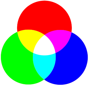
One of the other predominate used screen based color systems is RGB. This color model has a much wider gamut and as result has much brighter, vivid colors. It is an additive color space as the more light on screen, the brighter the image will be. This is why for CMYK it is hard to match some colors produced by RBG, because it has a much smaller gamut. Though it puts up a good fight and does its best.
RGB
Apart from CMYK the other main way to mix colour in the design world is using the RGB colour model.
Its stands for the primary colours of light Red, Green and Blue, used to produce all on screen colours for the display of images in electronic systems, for example televisions, computers and mobile phones.
It is an additive colour model in which each colour, Red, Green and Blue light are added together in a variety of ways and intensity’s from being fully on or fully off in order to produce wide colour spectrum. The basic principle is, the more light there is on screen the brighter and vivid the RGB colour will be.
Changing the Hue and Saturation in two of the three colour channels it results in making one of secondary colours in CMY. For example, Cyan is made by mixing Green + Blue of equal intensity, Magenta is made by Red + Blue and Yellow is made by Red + blue. Each Secondary colour is the compliment of one primary colour (RGB), when a primary is mixed with its complimentary secondary colour, then white is produced.
However RGB’s colour’s is device dependant, which means different devices will recreate a given RGB value differently, leading to a change in colour matches. So a RGB value is not the same across devices and you should not expect the same result unless there is a form of colour management, which will try, and balance/match the RGB value.
This causes a problem when it comes to printing, as it is an additive colour space is means it has a much larger gamut than CMYK and most inkjet and laser printers print in this colour mode.
There is no simple or easy conversion to change the colours apart from using a colour management system that is mentioned above. It results in most colours printed becoming darker, though some can be closely matched in CMYK. Another reason to explain why the colours differ when converting RGB into CMYK is that, on screen RGB uses pixels per inch (these are tiny and millions can be packed into one single inch). Where as CMYK prints in dots per inch, these are a considerably bigger resulting in reducing detail and the brightness of colour.
Spot Colour
A spot colour is any colour that can be printed in a single run. They are printed using offset printers, and the colours can be any colour, mixed or pure. Predominantly offset printing uses process colour, which are Cyan, Magenta, Yellow and Black to produce the final image normally where continuous tones (as in photographs) are required. However it can also use pre mixed inks, which within the industry are known as the true spot colours. Any colour generated by non-standard offset printer ink is one, for example; fluorescent colours, metallic and even glitter colours. As the inks are specially pre mixed it allows colours to be printed out at any time and out of the CMYK gamut range. A lot of these colours have much higher vibrancy and hard to replicate without using spot colours.
The standard industry-referencing guide to spot colours is Pantone®. It is the main company in the UK for digitizing and colour matching spot colours, with over 1000 swatches available. It allows each colour to have a name and serial number, so once typed in you have the exact same ink colour, as it is ready-mixed to produce a particular colour.
Duotones
A duotone is an image of a continuous tone, printed in only two colours/spot colours. These colours can be absolutely any colour and the duotone effect is made by separate greyscales of the different colour tones combined. It was traditionally used in photography before digital came along to make the black and white prints more exciting and have more of a visual impact –using sepia tones (muddy brown/copper colours) and blueprint tones (deep blue tones).
However in this digital age duotones are now used to create an eye catching more textured piece. This is aided by changing the hue and saturation on one or both colour – making the tones within the image brighter almost till it is hard to look at or till the image is very subtle and sophisticated.
Duotone printing only uses two plates, one for each colour. So as a result is much cheaper to print than a standard process colour in offset printing, which uses four. This could work for your advantage and save a lot of money.
Greyscale
Greyscale images hold the continuous tones of black and white and any colour in-between. A grey scale is distinctly different form black and white images, which only use two colours in them: black and white, these are particularly used in gaming imagery.
A digital greyscale image has set values/weights of colour within the greyscale range depending on the luminously of the image. These range from 0% being black to 100%, which is pure white. When converting a colour image to greyscale, the computer try’s to match the values to the luminously of the colour image using the RGB channels and converts them into there equivalent shade of grey. Some greyscale images are also know as monochromatic, these are images of neutral colours and their colour range only consists of one single colour.
Monotone
A monotone image only uses a single colour in it and the any tones of that colour. You can vary the intensity of the colour and tones by altering the hue and saturation within the image. Also depending on what stock you chose to print on –this will also alter the single colour and printed tones. Monochrome printing goes way back to the early century’s when it was very popular – artists used to paint with black or brown inks and dilute them to get the shades in between to paint realistic monotone pictures.
It is less used today as the digital age has sweep over but it is still popular within wet photography, using tones such a sepia and blueprint tones to create the monotone effect.
CMYK is shorthand for the colors cyan, magenta, yellow and key line black, each letter is pronounced separately. They are known together as the four color process or simply process color. CMYK works by chemically mixing the four colors together and by doing this it allows almost any color in the spectrum to be achieved.
This color model is worldwide and predominantly used the most in modern day industry offset printing (lithography). This print process works on a very simple principle, thank ink and water do not mix.
The images or text are put on plates, and each color has its own separate plate. These are first dampened by water then the colored by the ink, as a result the ink sticks to where the text and image is and the water to the area surrounding it. This image is then transferred to a rubber blanket on a roller and then finally onto paper. Hence it is called ‘offset’ as the image never goes directly onto the paper.
Each color plate is then printed precisely on top of one another on the paper to allow the colors to combine and build up the layers to form the final full color image. Cyan is the first plate and color to be printed then magenta, yellow and finally black which gives the extra details and deeper tones within the final image.
Black is added to the process as the black produced my mixing only CMY primaries will only give a dark muddy brown. Also using 100% CMY in the areas which is needed t produce black will build up and because of their concentration bleed and the image could loose sharp edges especially in text, and simply providing a black ink is cheaper.
The CMYK model works by using tiny drops of pigment (also known as halftones or screening), which allows less than the full saturation of the CMY primary colors. These tiny dots of ink are too small for the human eye to see on its own so when we look at an image we cannot see the overlapping dots, and we see just one color. Without using this process we would only be able to produce six colors; Cyan, magenta, yellow and their complentory color red, green and blue. So halftone gives us a full continuous range of color to work from.
CMYK is known as a subtractive process as it partially or fully masks certain colors. It takes away the natural light and white pigment of the paper, and means the more ink on the paper the darker the image will be.
One of the other predominate used screen based color systems is RGB. This color model has a much wider gamut and as result has much brighter, vivid colors. It is an additive color space as the more light on screen, the brighter the image will be. This is why for CMYK it is hard to match some colors produced by RBG, because it has a much smaller gamut. Though it puts up a good fight and does its best.

RGB
Apart from CMYK the other main way to mix colour in the design world is using the RGB colour model.
Its stands for the primary colours of light Red, Green and Blue, used to produce all on screen colours for the display of images in electronic systems, for example televisions, computers and mobile phones.
It is an additive colour model in which each colour, Red, Green and Blue light are added together in a variety of ways and intensity’s from being fully on or fully off in order to produce wide colour spectrum. The basic principle is, the more light there is on screen the brighter and vivid the RGB colour will be.
Changing the Hue and Saturation in two of the three colour channels it results in making one of secondary colours in CMY. For example, Cyan is made by mixing Green + Blue of equal intensity, Magenta is made by Red + Blue and Yellow is made by Red + blue. Each Secondary colour is the compliment of one primary colour (RGB), when a primary is mixed with its complimentary secondary colour, then white is produced.
However RGB’s colour’s is device dependant, which means different devices will recreate a given RGB value differently, leading to a change in colour matches. So a RGB value is not the same across devices and you should not expect the same result unless there is a form of colour management, which will try, and balance/match the RGB value.
This causes a problem when it comes to printing, as it is an additive colour space is means it has a much larger gamut than CMYK and most inkjet and laser printers print in this colour mode.
There is no simple or easy conversion to change the colours apart from using a colour management system that is mentioned above. It results in most colours printed becoming darker, though some can be closely matched in CMYK. Another reason to explain why the colours differ when converting RGB into CMYK is that, on screen RGB uses pixels per inch (these are tiny and millions can be packed into one single inch). Where as CMYK prints in dots per inch, these are a considerably bigger resulting in reducing detail and the brightness of colour.
Spot Colour
A spot colour is any colour that can be printed in a single run. They are printed using offset printers, and the colours can be any colour, mixed or pure. Predominantly offset printing uses process colour, which are Cyan, Magenta, Yellow and Black to produce the final image normally where continuous tones (as in photographs) are required. However it can also use pre mixed inks, which within the industry are known as the true spot colours. Any colour generated by non-standard offset printer ink is one, for example; fluorescent colours, metallic and even glitter colours. As the inks are specially pre mixed it allows colours to be printed out at any time and out of the CMYK gamut range. A lot of these colours have much higher vibrancy and hard to replicate without using spot colours.
The standard industry-referencing guide to spot colours is Pantone®. It is the main company in the UK for digitizing and colour matching spot colours, with over 1000 swatches available. It allows each colour to have a name and serial number, so once typed in you have the exact same ink colour, as it is ready-mixed to produce a particular colour.
Duotones
A duotone is an image of a continuous tone, printed in only two colours/spot colours. These colours can be absolutely any colour and the duotone effect is made by separate greyscales of the different colour tones combined. It was traditionally used in photography before digital came along to make the black and white prints more exciting and have more of a visual impact –using sepia tones (muddy brown/copper colours) and blueprint tones (deep blue tones).
However in this digital age duotones are now used to create an eye catching more textured piece. This is aided by changing the hue and saturation on one or both colour – making the tones within the image brighter almost till it is hard to look at or till the image is very subtle and sophisticated.
Duotone printing only uses two plates, one for each colour. So as a result is much cheaper to print than a standard process colour in offset printing, which uses four. This could work for your advantage and save a lot of money.
Greyscale
Greyscale images hold the continuous tones of black and white and any colour in-between. A grey scale is distinctly different form black and white images, which only use two colours in them: black and white, these are particularly used in gaming imagery.
A digital greyscale image has set values/weights of colour within the greyscale range depending on the luminously of the image. These range from 0% being black to 100%, which is pure white. When converting a colour image to greyscale, the computer try’s to match the values to the luminously of the colour image using the RGB channels and converts them into there equivalent shade of grey. Some greyscale images are also know as monochromatic, these are images of neutral colours and their colour range only consists of one single colour.
Monotone
A monotone image only uses a single colour in it and the any tones of that colour. You can vary the intensity of the colour and tones by altering the hue and saturation within the image. Also depending on what stock you chose to print on –this will also alter the single colour and printed tones. Monochrome printing goes way back to the early century’s when it was very popular – artists used to paint with black or brown inks and dilute them to get the shades in between to paint realistic monotone pictures.
It is less used today as the digital age has sweep over but it is still popular within wet photography, using tones such a sepia and blueprint tones to create the monotone effect.
The colour breif...

Here is the breif which I have been looking at most recently and finishing. It explores some commonly used colour prococess whihc are involved in print today, and explains how colour on screen (RGB) and off screen (CMYK) are created and mixed to make a wide range of colours in the spetrum. This has all been very new information for me to learn, however it has also been very intressting and will help me decide in future projects what print process is my best opion for the time I have, money, effect etc and also which colour process are suited too.
Sunday, 19 October 2008
Washing advertisements!
DONT PANIC- live breif
We were asked to design the poster to go inside Dont Panic's December issuse, the title was Machine. My deisgn was based on a mobile phone, and how we as a society view them as essential & how the majority of people opt to talk over text or over the phone rather than direct face to face communication - which can demean the conversation. My entry design is below:

Since I am using the theme of 'freshly washed sheets' for my GOOD project, I saw this advert and thought it was appropriate. I like how light and airy the sheets are, bright white and perfectly clean, I want to try represent this through my own work that freshly washed sheets are all of these. Here is the new Surf advertisment I saw on the television and liked especailly .
Thursday, 5 June 2008
BASE-V


BASE-V is a group of artists from São Paulo, Brazil. It started in 2002 with the publishing of the experimental magazine "V". After that, the group´s web site became a comunity of experimental graphic artists, exibiting works from all over the world ever since. The group works with several medias, from artesanal publications to graphic instalations, mixing supports and materials, participating in galery shows and street interventions.
Faile
"
Scratch the surface and eat deeper into the art and you would most likely sense a tinge of dualism and collaboration. They seem to dwell on things like love|hate, violence|peace, ugly|beautiful, war|peace and so forth. - Faile
"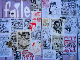
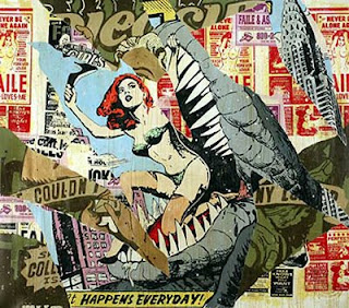
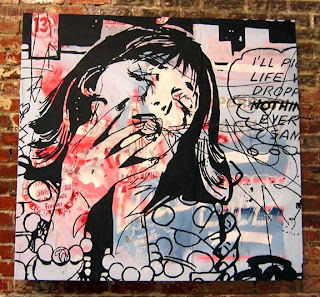
Combines street artwith illistartion & fashion. Loose sketchy style all initaly hand rendered includling the stencils, styel of 1970's comic strips and carachters.
Daisy De Villenuene


A quirky, childlike imagination flows through the colourful books and felt-tip illustrations of Daisy de Villeneuve, born in 1975, London. Again very angled simply line drawing form her illistartions, I link her style similar to Kate Moross who has also worked for Topshop.
Wednesday, 4 June 2008
Hungry Bears
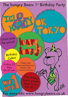
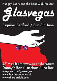
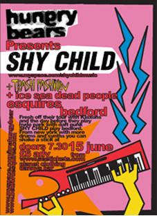
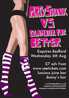
Hungrey Bears in a organisation form my home town of Bedford, it promotes gigs and events in one of the nightclubs and main music venue, before this Bedford had nilche of new upcoming music and good club nights! Chris Smith is one of the dj's at the club, 'The Pad' and is currenlty working for Bedfordshire council on their graphic design team. These are some of his poster designs for Hungrey Bears, he has a very distinct cartoon style using straight lined drawing skills making them hevily vectorized and bold, also using dynamtic eye catching colours and use of text. Here are some of my favrouits:


Tuesday, 3 June 2008
Kerry Roper...


I personally love Roper's work. it combines mixed media, mainly photography digitally enhanced and composed with illustrations. On top of some of these compositions is type, this has become much more prominate within his later works. He studied at Buckingham shire college doing graphic design and now has become globally established as a graphic designer. His work has appeared in many books and magazines, including, 'It's a Matter of Illustration' by Victionary, 'Thousand Type Treatments' by Rockport, 'Typographics' by Rotovision and a major feature in the Japanese design magazine.
The thing which grabs me about his work, is the clustered layered of block colours, messy style which his work holds, yet at the same time there is clear precision and looking up close each line in immaculate. Recently he has worked with fellow designer Si Scott, and you can see a clear resemblance now between each others work which is now mainly illustration and heavily pixilated darkened imagery playing around with thershhold.
'Sigh' Scott


Si scott is a current designer in the lime light at the moment. He leaft school at 16 and then started at foundation course in Leeds at the college or art and design, Since then his work became noticed and now darts all over the country on business for clinets. Wat makes his work really stand out is his use with tpyography, producing some really innovative type.
He starts with rough sketches trialing layouts and picking at fonts, slighty altering them/changing them. Then he brings fineliners to the piece to bring it to life wiht his flowing, loose but highly intricque illistartions. Scott works on a much larger scale then the actual final image size, he draws it out then scans the illistations in at 1000dpi at 125% so when it is decreased to the actual size it is very crisp and clean looking image.


Friday, 30 May 2008
Work found on FFFFOUND!

The simplicity of this piece of type is how each word interlinks with the subject matter of graphic design, with objects commonly used, simply printed in heavy bold black font against a white background, in my opinion very effective.

With this piece it is how the font is overlayed over one another and is still readable, though it is a thin typeface so minimastic at the same time which adds to the effect.


The work which i have found was mainly typography and layout driven which have caught my eye.
Subscribe to:
Comments (Atom)