Friday, 30 May 2008
Work found on FFFFOUND!
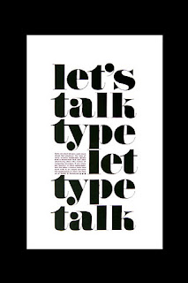
The simplicity of this piece of type is how each word interlinks with the subject matter of graphic design, with objects commonly used, simply printed in heavy bold black font against a white background, in my opinion very effective.

With this piece it is how the font is overlayed over one another and is still readable, though it is a thin typeface so minimastic at the same time which adds to the effect.
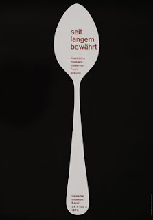
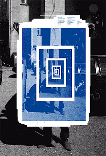
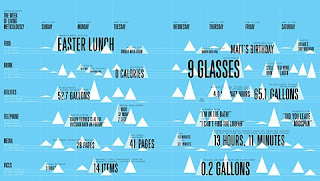
The work which i have found was mainly typography and layout driven which have caught my eye.
Tuesday, 20 May 2008
Lisa Weinburg
Freelance fashion illistartor and phototgrapher, i discovered her work through flickr. I like her use of mix media and combining the theme of my current project sewing styles in corperted within mixed media and water colour. Her loose style of sketching and outlines of the figures matched the looseness of the colour she has used, it dose not fit with in the outlines.
Tuesday, 13 May 2008
Sandrine Pelletier
Sandrine Pelletier, adds a whimsical twist to her subject matter. She is a 29 year old graphic designer and visual artist lives and works between Lausanne, Switzerland and Paris, France. She graduated from the Ecole Cantonale d'Art de Lausanne (ECAL).
It is not simple coincidence that Pelletiers work explores illistartion and the juxtaposition of archaic media usage and the subject matter being of cultural post-modernity. She was an ex-heavy metal fan and handles her medium of embroidery and crochet perfectly still allowing her music influence to shown through inparts. "Will fight for a dream", is one of her most famous projects and is a sociological coverage about Tribal/gang Violence and street culture in England, where she was previously living for some time. It is a series of embroideries depicting young people from a 'council estate' background, organizing events such as wrestling matches from their parents backyard. All her works have an embedded poignat twist or messgae which she wanta to convey to the reader, when on a glnace her work appears very nice and pleasent, it is only when you look twice you see the hidden detail. I particualty like her style, similary wiht Bowley combining stitching wiht mixed media.
Eleanor Bowley
Bowley is an illistartor, with her unique style of creating images from stitching and trimmings on recycled fabrics, she was commissioned as part of her final year project to design a range of clothes sold within the Urban Renewal area of Urban Outfitters. Her style is very distinctive, i think wha draws me to her work is the delicassy wihtin her lines and stitching which is contrasted wiht block colour or fabric.
Tuesday, 6 May 2008
Harry Enfield - Public information 1950's sketches
In reserach for the role of women in the year 1950 i looked at these Harry Enfield mini sketches. They are very stereotypical of the ear, that women should be seen and not herad and consdiered objects.
Thursday, 1 May 2008
Be positive Campaign
This was still part of my Design for Communication breif, working wiht Karl Taylor we designs a series of signs aiming to look realsitic and passable as real signs. We wanted people to improve there self confidence and stop looking at their negatives and focus on their possitives. Here is a sign which designed mainly targeting girls and body weigh issues.
Design for Commuincation!
This was my 1950's calender project. I had to design a calender to suit the year 1950 considering the key events, colours, type and format and stock. Ideally i would of like to print on an even lighter stock, to add a more newspaper type of effect, however i am still pleased wiht my final results.
Assasins mail shot/advertsiment. I had to design a post through the door mail shot for an assain compnay.
Calender research
Subscribe to:
Posts (Atom)